Over the years, together we’ve dabbled in graphic design, photography + film work, illustration, and web design + code, trading first as sole traders with our own small businesses, then combining them to form a partnership under the name Lightbulb Head. Since having children we’ve folded the business so aren’t currently earning money from our creativity, but that hasn’t stopped us from creating.
In this section there’s a selection of some of the projects that we’ve worked on over the years – scroll down for the most recent, or use the categories on the left to see specific projects.
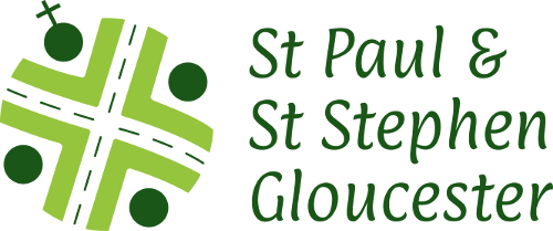
In 2019 we re-designed the logo of St Paul and St Stephen’s church, Gloucester. The three themes that the congregation wanted to be communicated through the logo were the physical location, community and transformation. The shape and angle of the main cross that runs through the centre of the new logo is directly taken from a map of the crossroads on Stroud Road, at which St Paul and St Stephen’s stands. The OS map symbol for a church can be seen in the top left quadrant of the cross, in the exact position in which the church can be found if the logo is viewed as a map. The main cross shape shows that Jesus is at the centre of the church and community. In a lighter shade of green, four arrows point towards the centre, these symbolise inclusivity and welcome, inviting people from all walks of life to join the church. Viewed along with the four circles in darker green, these arrows become people with their arms raised in praise. The colour green represents growth, renewal and new life. Green is also the colour used to represent ‘ordinary time’ within the church year.
See other creative items relating to graphic design, logo
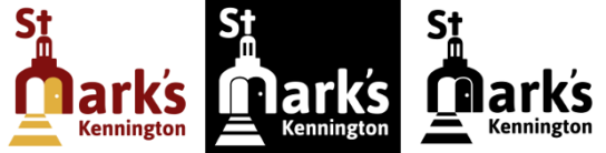
We designed the logo for St Mark’s Church in Kennington, London in 2015. We circulated a questionnaire around the congregation with regards to how the church views itself and what the important aspects of its culture are. A multitude of responses were received, reflecting the diversity of the congregation, but one key, consistent aspect cropped up again and again; that of welcome. After throwing a few ideas down on paper, we settled on the concept of an open door with light flowing ou, incorporating the shape of the church, as it has quite a recognisable silhouette. Along with the new logo we put together a pared-down style guide containing a suggested, consistent colour palette to use for all printed media and electronic media.
See other creative items relating to graphic design, logo
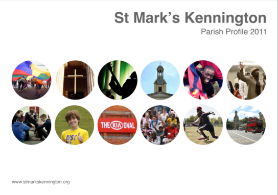
When St. Mark’s Kennington church in London were advertising for a new vicar, Kiri did the graphic design for the parish profile, drawing together text, photos and graphics that had been created by others into a coherent pack for the new incumbent to understand what they were applying for
See other creative items relating to graphic design

